Edit: This article is a little out-dated now, as Bootstrap is on version 3 featuring a completely different and fluid grid. It’s still applicable if you are working with the older Bootstrap (up to version 2.3.2)
One of the challenges I have faced when doing my front-end work is trying to communicate to designers who have not done too much responsive work with Bootstrap, how the grid works. It’s not as simple as telling someone to make a 968px wide layout anymore. One has to consider differing breakpoints. One of the interesting things about Twitter bootstrap is that in its scaffolding guide it talks about breakpoints at 1200px and 980px but you don’t actually have that much width to work with. There is always a margin applied to the left of the layout resulting in only 1170px of available space on a 1200px grid.
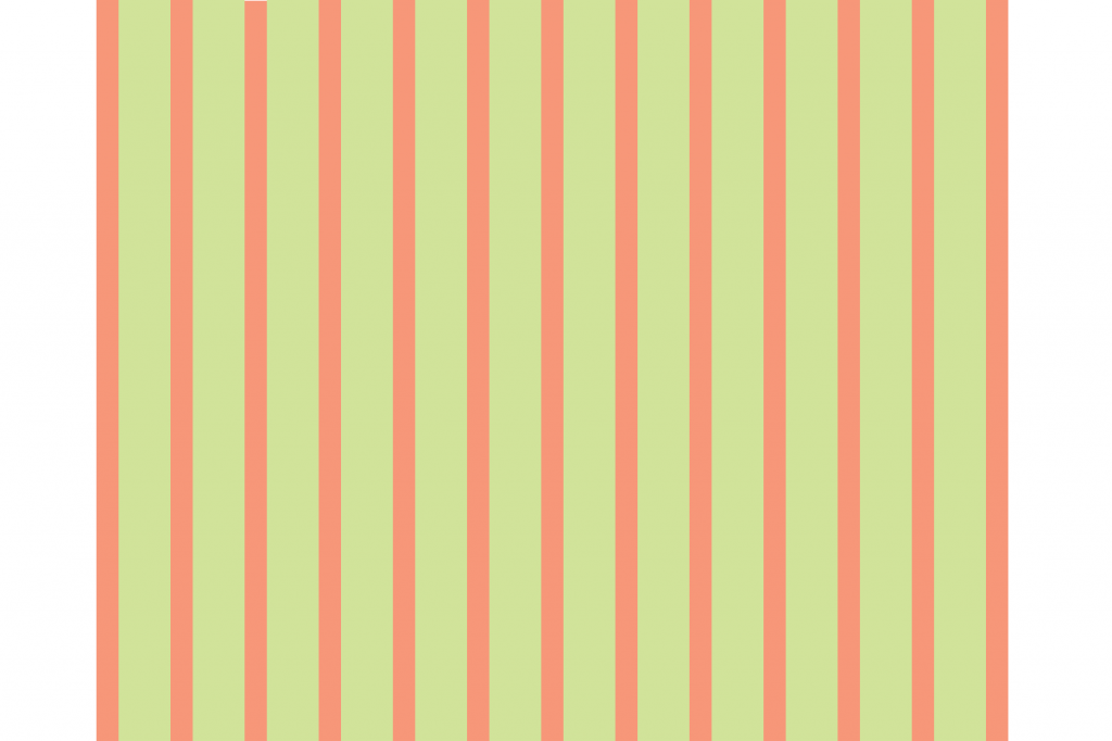
Furthermore, one has to then consider the margins in between the columns on the grid. Rather than leave this to interpretation I created this PSD template. You can just rip out the layers from it and put it on top of your existing design, or use it as a starting point to any of your designs which will utilise Bootstrap. It overlays a translucent grid for the top 3 bootstrap breakpoints: 1200px, 980px and 768px.
You can utilise any of the space in green, but do not place anything on the leftmost or rightmost red areas.
I should, at this point, also stress that if you can/want to use the fluid layout of Bootstrap then this template will obviously be of no use to you.
You can download the template by clicking here:
